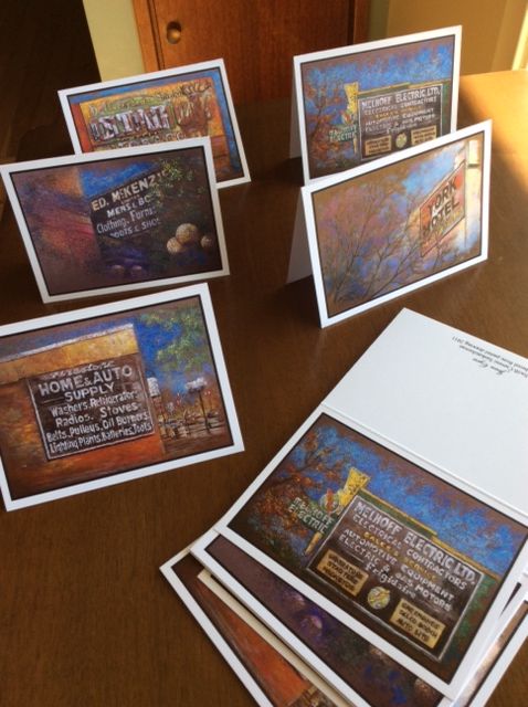
I've always liked the faded advertising signs scattered around downtown Swift Current. No faux-vintage decoration, they're a genuine historical touch that add a little character to our city.
The family names of Melhoff Electric and Ed McKenzie Menswear belong to generations past and present, and also to my childhood. I remember going with my dad to Home & Auto to buy important things like chicken wire or maybe gopher traps. The York Hotel I've only set foot in once or twice, but I think the bar is still serving faithful patrons.
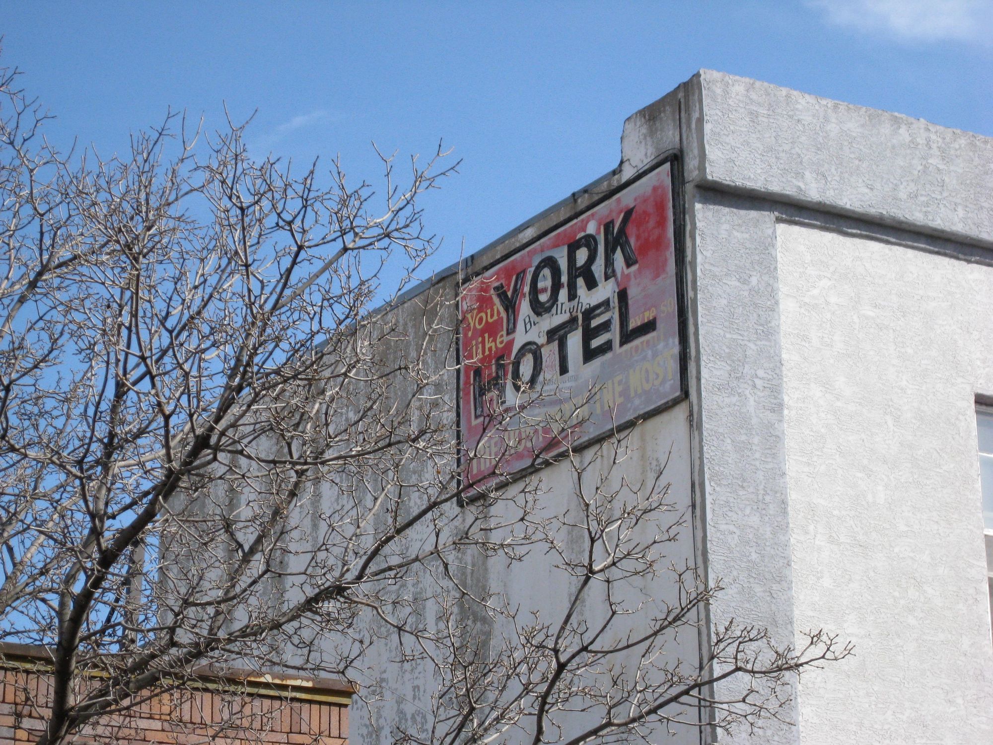
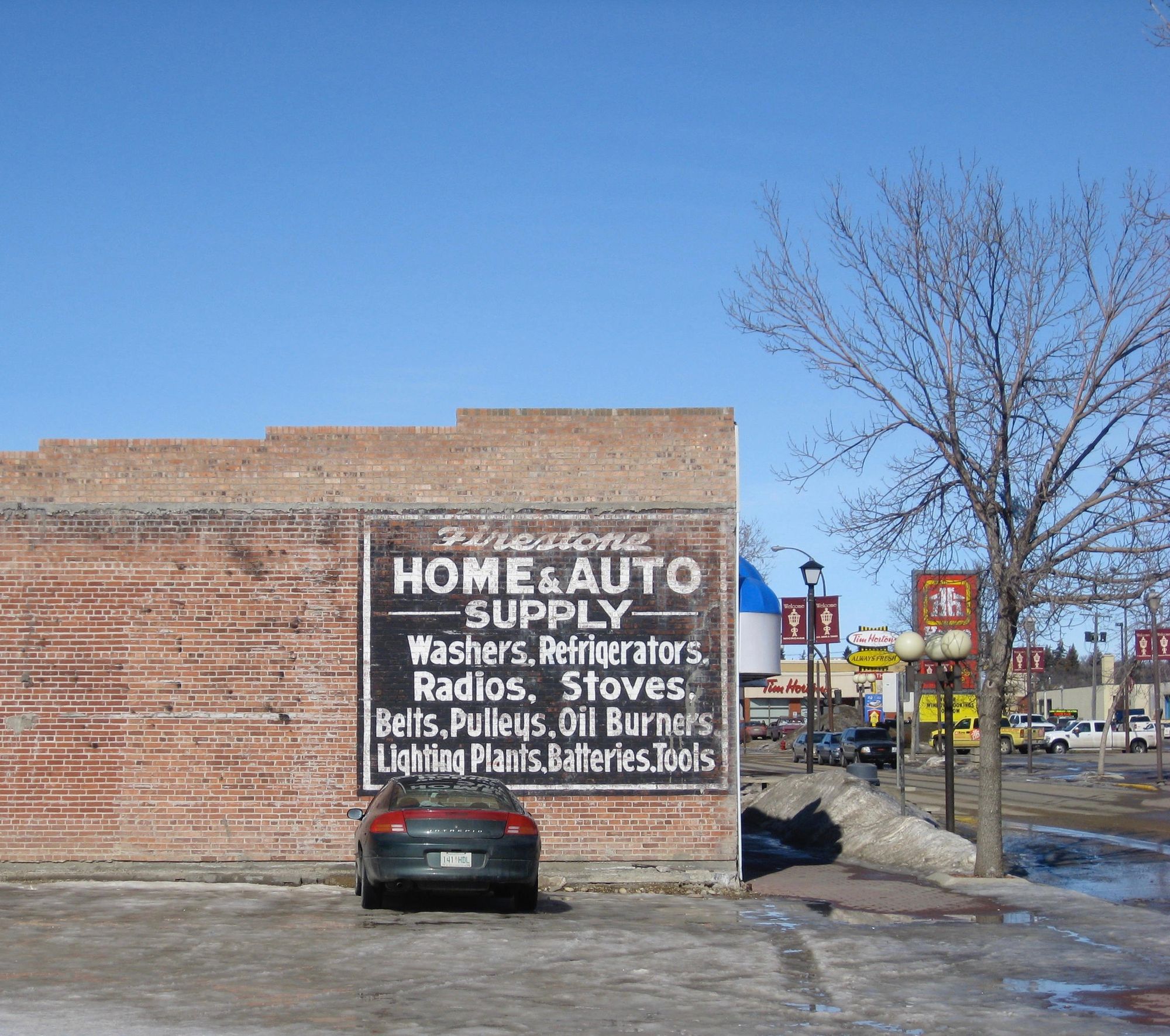
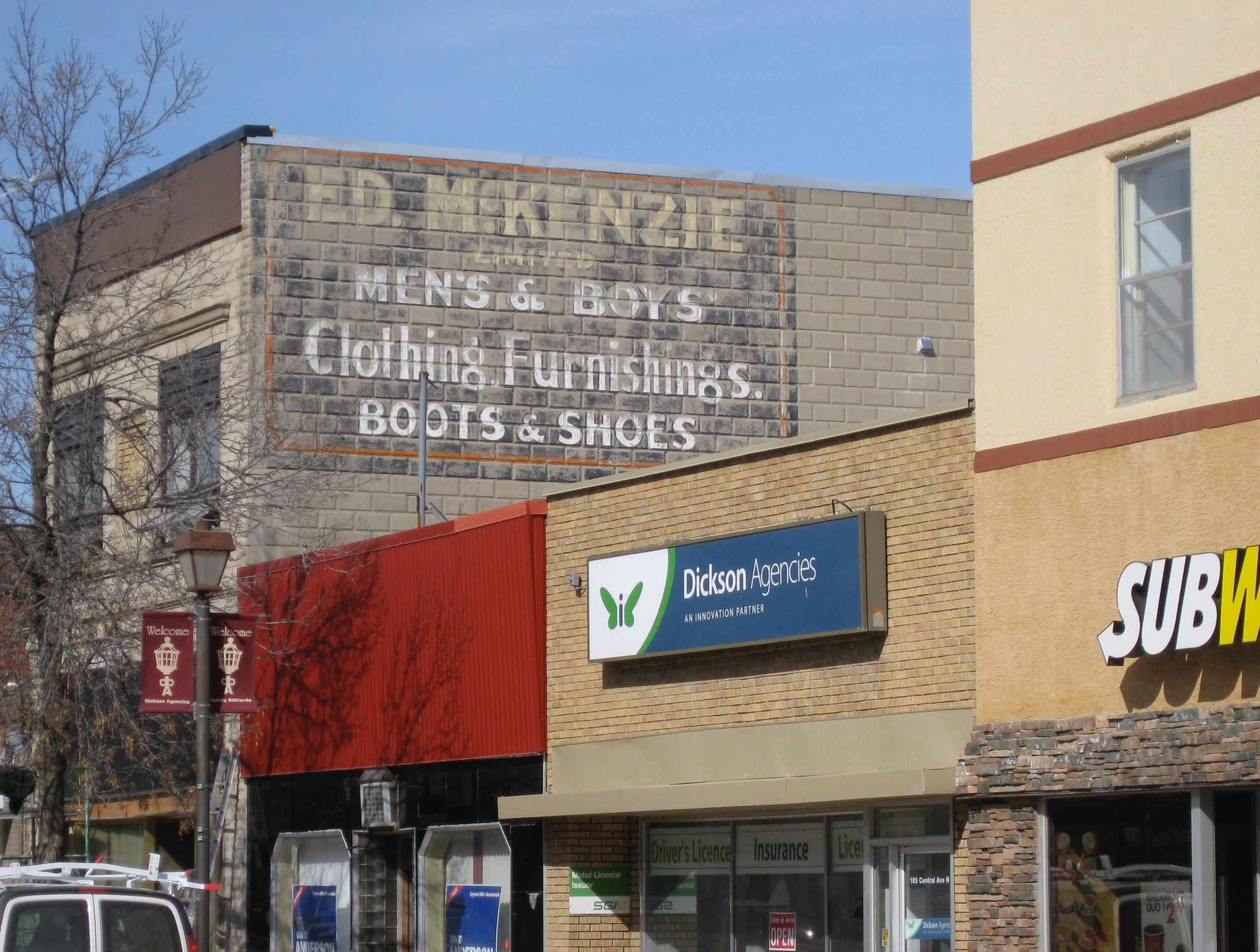
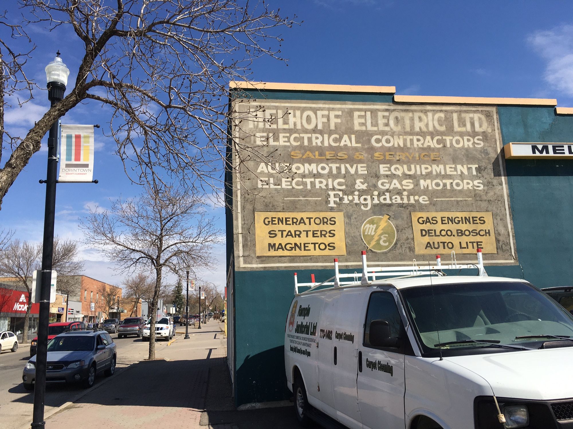
The painted lettering has a charm that you just don't find in the shiny plastic franchise signs of Subway or Home Hardware. There's personality and practicality in the weathered words that tell people exactly where they can find a pulley or an oil burner or men's boots.
A decade ago I chose these signs for a series of pastel artworks. I'm glad I captured them before the outdoor lettering faded even more or the signs disappeared entirely under a new coat of paint.
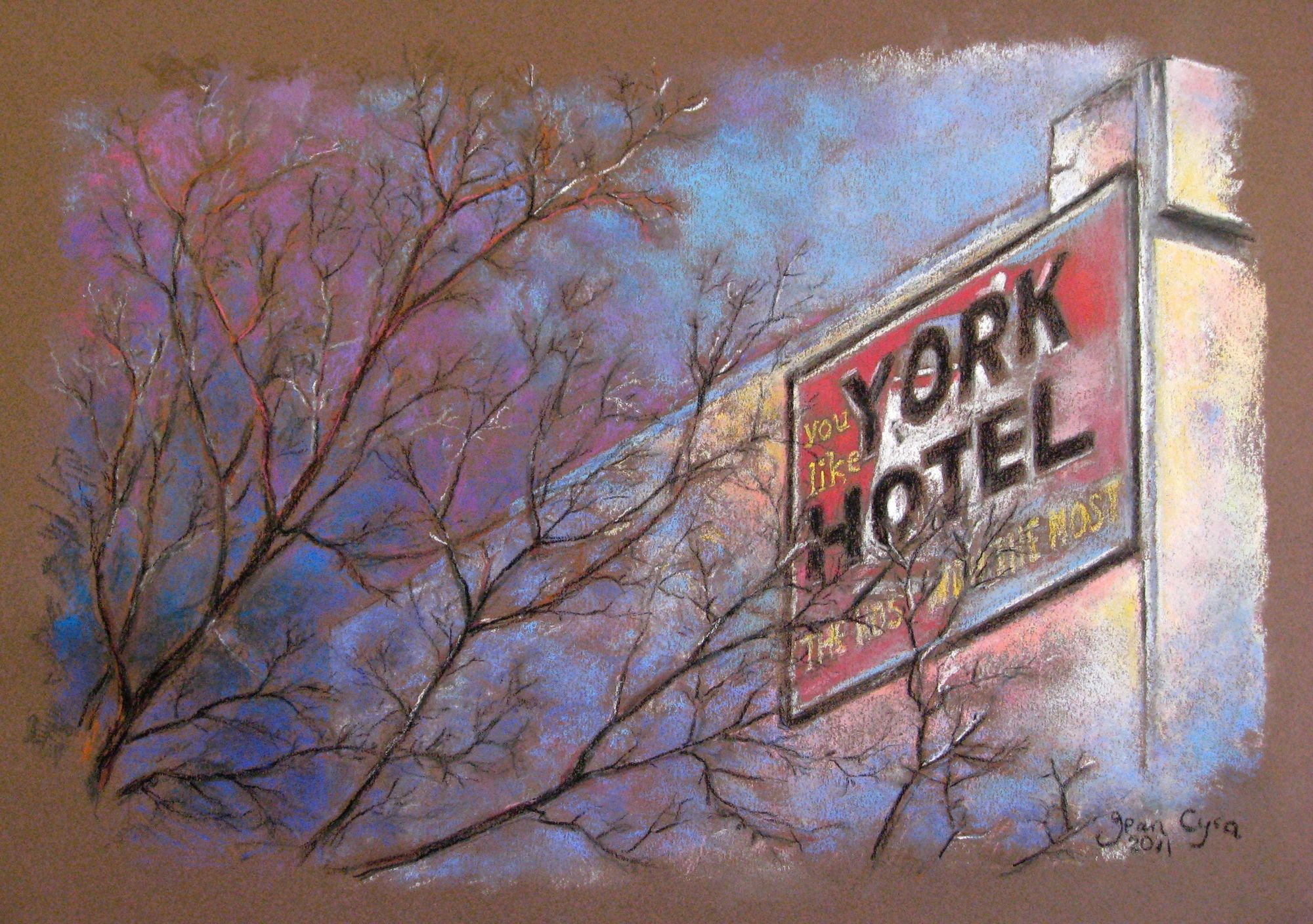
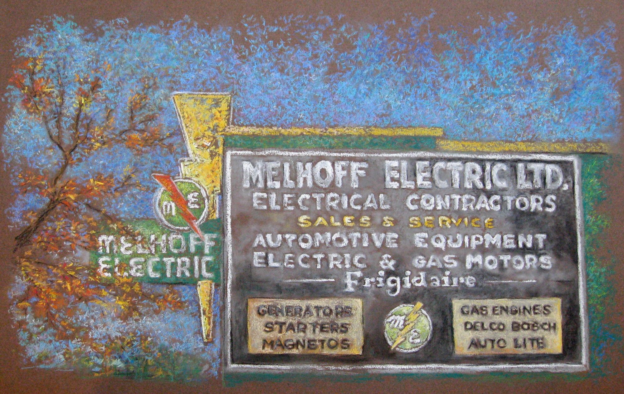
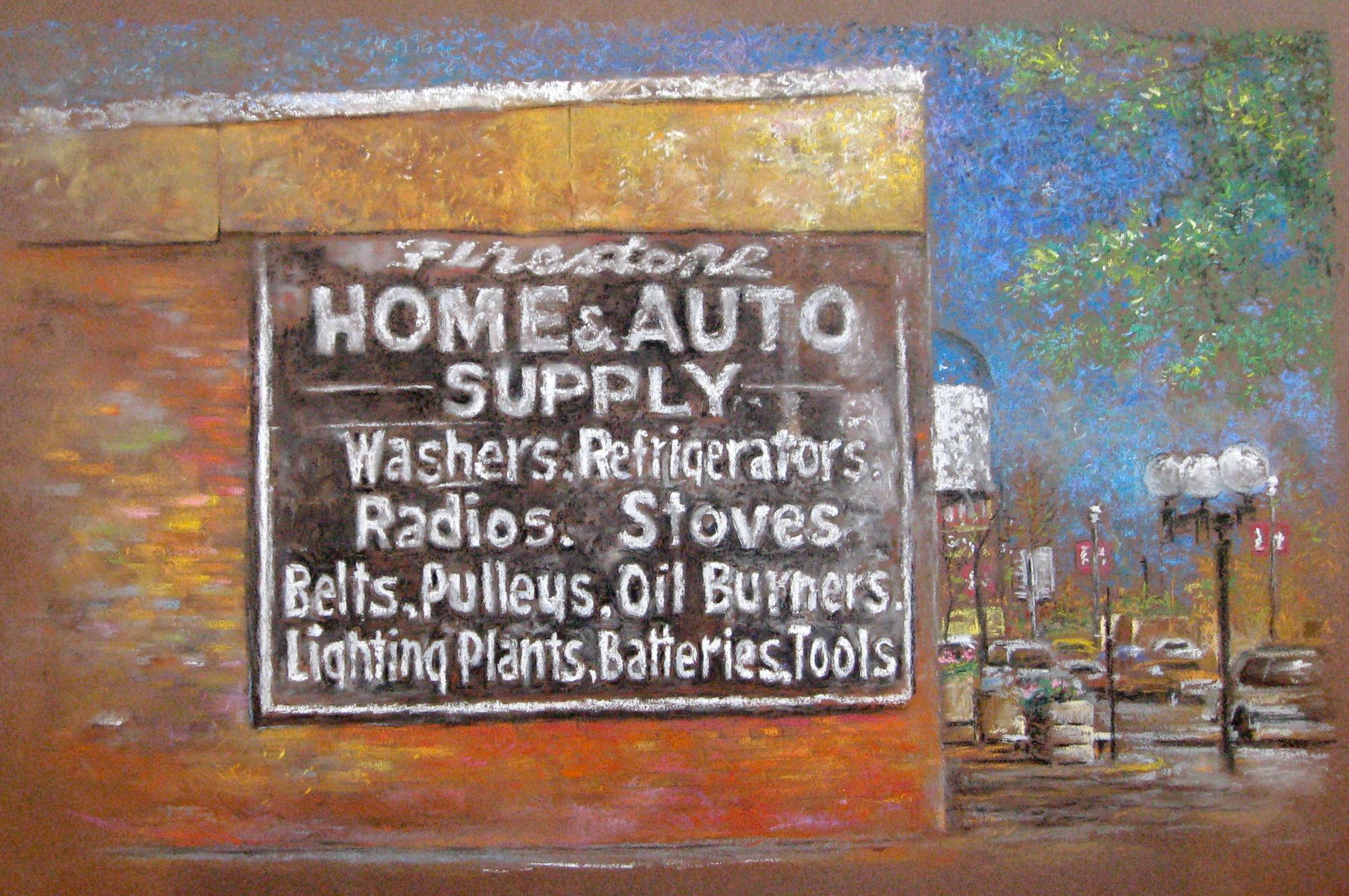
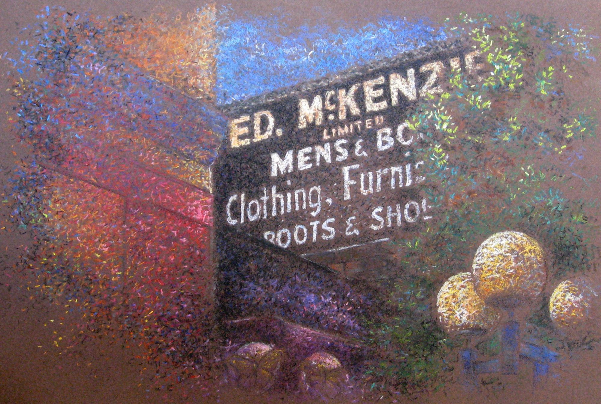
My pictures were done with conté, a small hard pastel that's not as dusty as soft pastel or as buttery as oil pastel. It's a medium that suits me, lots of little marks you can layer and mix, and change your mind as you go, or pull out a mark you don't like with a handy kneaded eraser. I used a lot of artistic license with the colours... why let reality get in the way of personal expression.
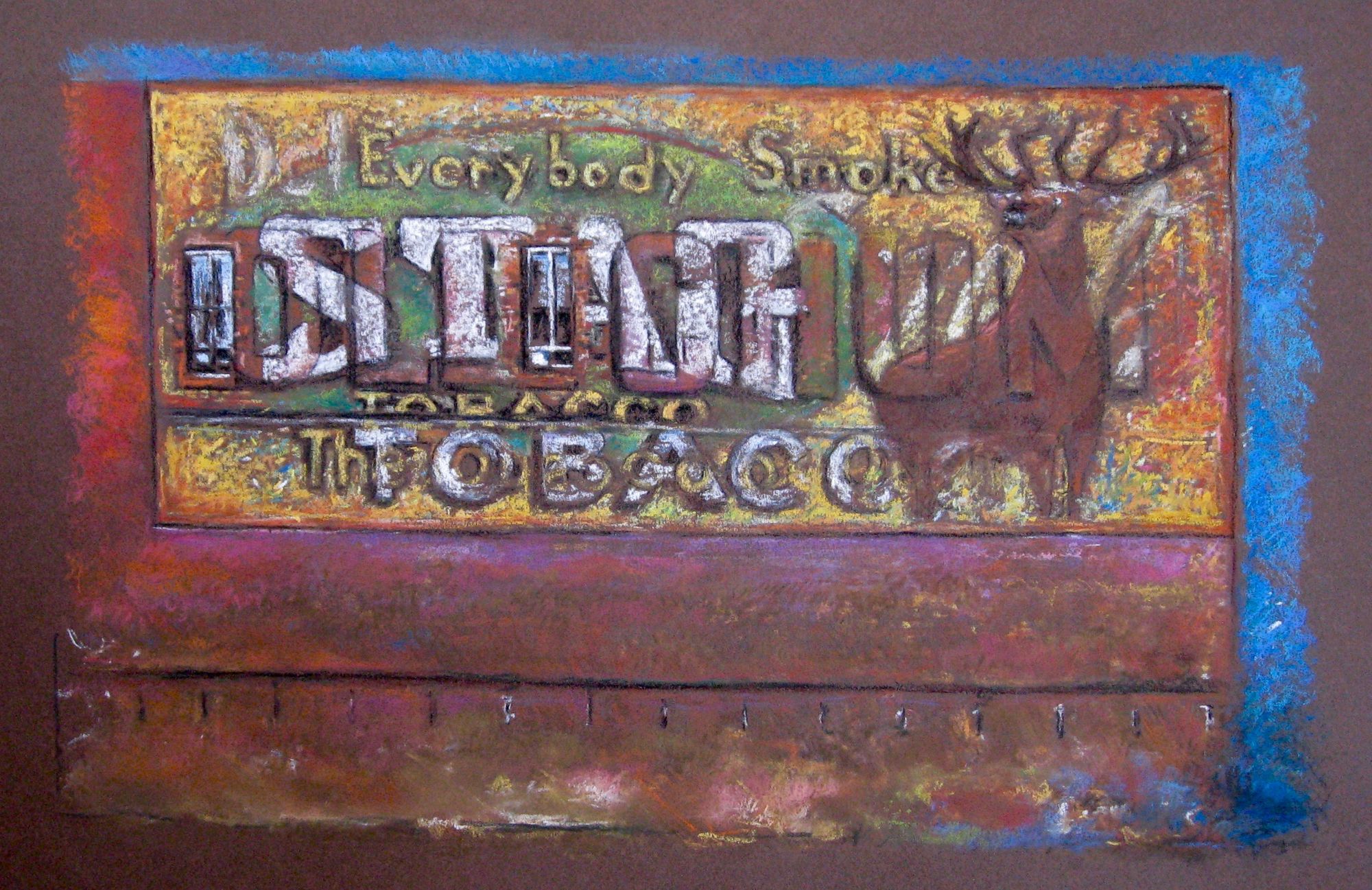
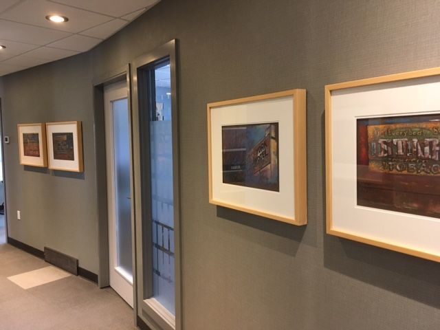
I was fortunate to sell this series, and the pictures have been hanging in the Alpine Dental Clinic for some years. It makes a dental visit a little more positive for me as I check out my work when I walk down the hallway to get a cleaning or a root canal. Much appreciation to friends who are also patrons of the arts!
I made packages of cards to sell at our local museum which was a nice project for awhile. I still have a few kicking around in my archives.
